


Formel Skin is Germany’s largest digital dermatology service, combining monthly prescription treatments delivered to your home with continuous support from your doctor online. Unlike traditional dermatology, patients can reach their doctor 24/7 for ongoing care.
Retention in the first 1–2 months was our steepest drop-off point. Data showed patients who messaged their doctor at least once in the first month were far more likely to stay subscribed, making Messages a critical lever for retention. Yet adoption and satisfaction with the feature were lower than expected. We set out to fix this — and while engagement rose sharply after launch, it also surfaced new challenges we had to solve.
Client
Formel Skin
Role
Product / Prototyping / User research
Year
2024
The Problem
For our patients, reaching out to their doctor typically wasn't a casual chat, they often came at a moment of stress or doubt. Their skin may be reacting badly to treatment, they worried treatment wasn’t working, or they had big concerns like pregnancy, other medications, or how their skin would tolerate new products. Many looked through FAQs first, but when they finally messaged, it was because they needed personal reassurance from a doctor.
The original message feature design didn’t meet them in that moment. It mirrored a rigid consultation model:
For doctors, this queue-based structure worked well, it kept triage efficient and manageable. But for patients, it felt transactional and cold. The system put walls up at exactly the moment they needed connection. Over time, that mismatch eroded trust (which we see through reviews patients leave on individual message interactions), reinforced negative experiences many already carried from traditional dermatology, and drove cancellations before treatment had time to work.
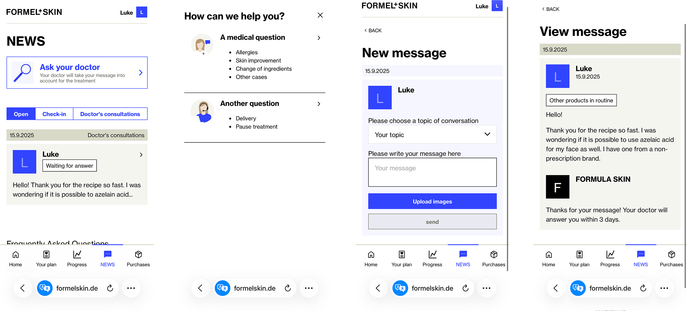
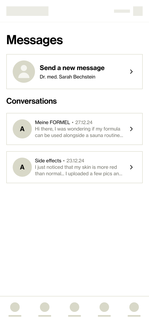
Old messages interface
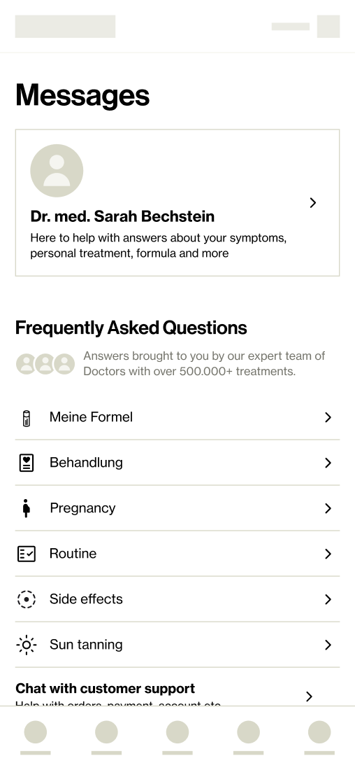
Insights from Patient Data
Closed conversations felt abrupt
Patients were cut off even if issues weren’t resolved.
Generic, repetitive replies
Doctors frequently reused templates to handle volume, which felt impersonal
“Hacking” the system
Patients tried replying through feedback forms or customer support to reach their doctor.
These patterns pointed to one clear need: patients wanted continuous, human dialogue, not fragmented transactions.
Daily Doctor Core Workflow
Doctors weren’t casually chatting in a WhatsApp-style inbox. Their workflow was structured inside Kabinett, a medical tool optimised for safety and efficiency. Any change to the patient-side experience risked ripple effects across this carefully balanced system.
01
Daily Patient Assignment
Medical lead
Each day the medical lead distributes new or existing patients across doctors, balancing workload and capacity.
02
New Consultations Prioritised
Doctors
Doctors begin with new patient consultations, which take priority and are usually handled within 24h.
03
Patient Message Queue
Doctors
Prioritised using a scoring system that considered diagnosis severity, reported side effects, urgency, and time waiting (target response time 24–48h)
The Challenge
Patients wanted continuity and reassurance; doctors needed structure and prioritisation. A thread-like chat promised more trust and engagement, but introduced risks:
💭
How might we design a messaging experience that feels human and continuous for patients, while preserving the efficiency and safety doctors need?
Chat Thread vs. Consultation
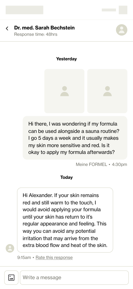
One of the biggest pain points was patients couldn’t reply or add further context once they hit send or a doctor “closed” a consultation after s reply. Many had follow-ups but were blocked, leading them to hack other channels.
Chat Thread (Patient-first)
Continuous conversation, easier to follow up and build trust.
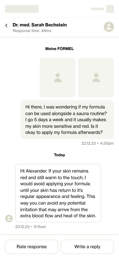
Consultation approach (Doctor-first)
Existing model with new thread UI, but left patients feeling cut off.
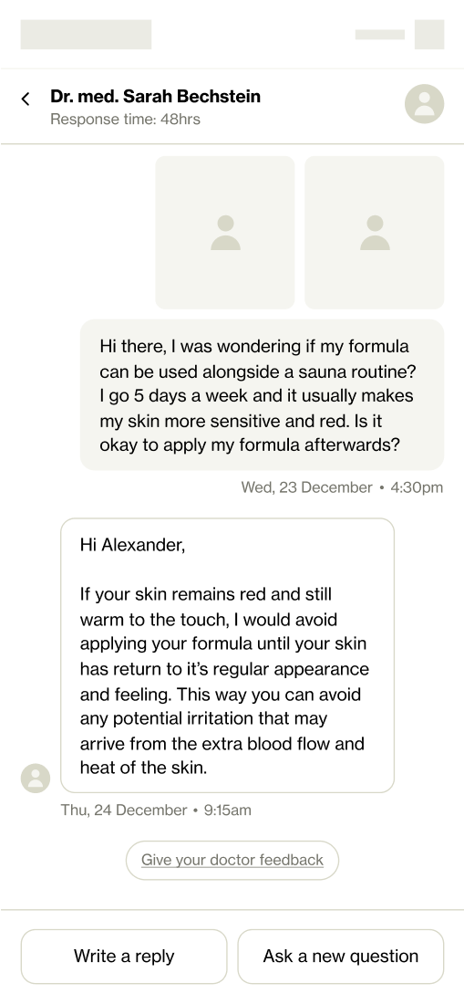
We landed on a middle path, chat on the surface, consultations under the hood.
One of the biggest patient pain points was they couldn’t reply or add further context once they hit send or a doctor “closed” a consultation after a reply. We new solution allowed for:
This gave patients the feeling of a continuous conversation while preserving guardrails for doctors.
Designing for Safety and Relevance
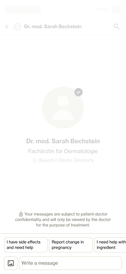
The new messaging flow wasn’t just about making it feel smoother for patients, it also had to work within the realities of medical care. That meant every change needed to balance patient clarity and empathy with doctor triage and safety requirements. Two key ares of communication we needed to address were themes (for categorisation) and side effects (for patient safety).
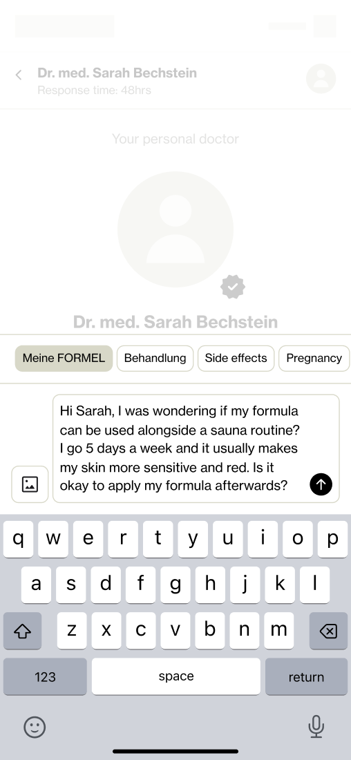
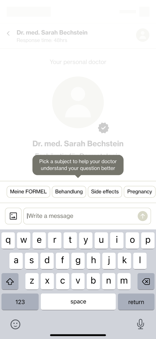
Refined themes
A cleaner, simplified list that patients could actually relate to, while still mapping to the categories doctors needed.
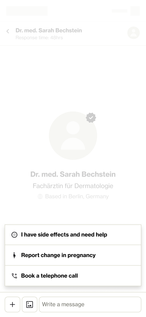
Alternative, quick actions
Shortcuts like “I have side effects” that launched lightweight flows to collect structured info automatically.
The final approach kept themes in place, but rebuilt them with clearer language and categories patients actually understood, preserving the doctors’ safety net without adding extra friction for patients.
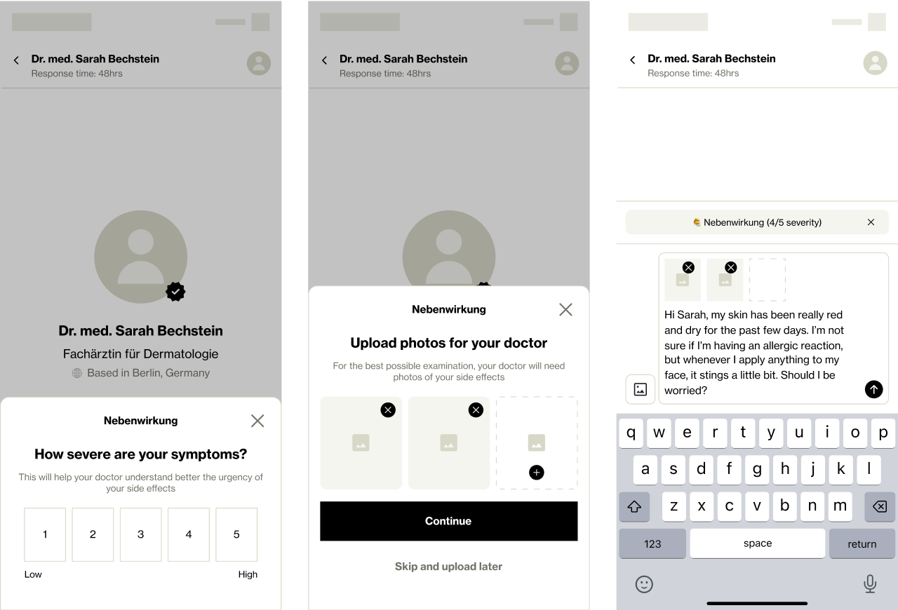
Side Effects Flow
Side effects were one of the most emotional and risky moments in a patient’s journey. For acne especially, an initial “purge” phase often made skin worse before it got better. Patients panicked, questioned their treatment, and many abandoned their subscription altogether.For doctors, side effects also carried medical risk. If a message was miscategorised or missing details like photos, it slowed their ability to reassure patients or adjust treatment safely.To address this, we built a dedicated side-effects flow:
This gave patients empathy and guidance in a vulnerable moment, while doctors received structured, actionable information to respond quickly and safely.
Learnings and Next Steps
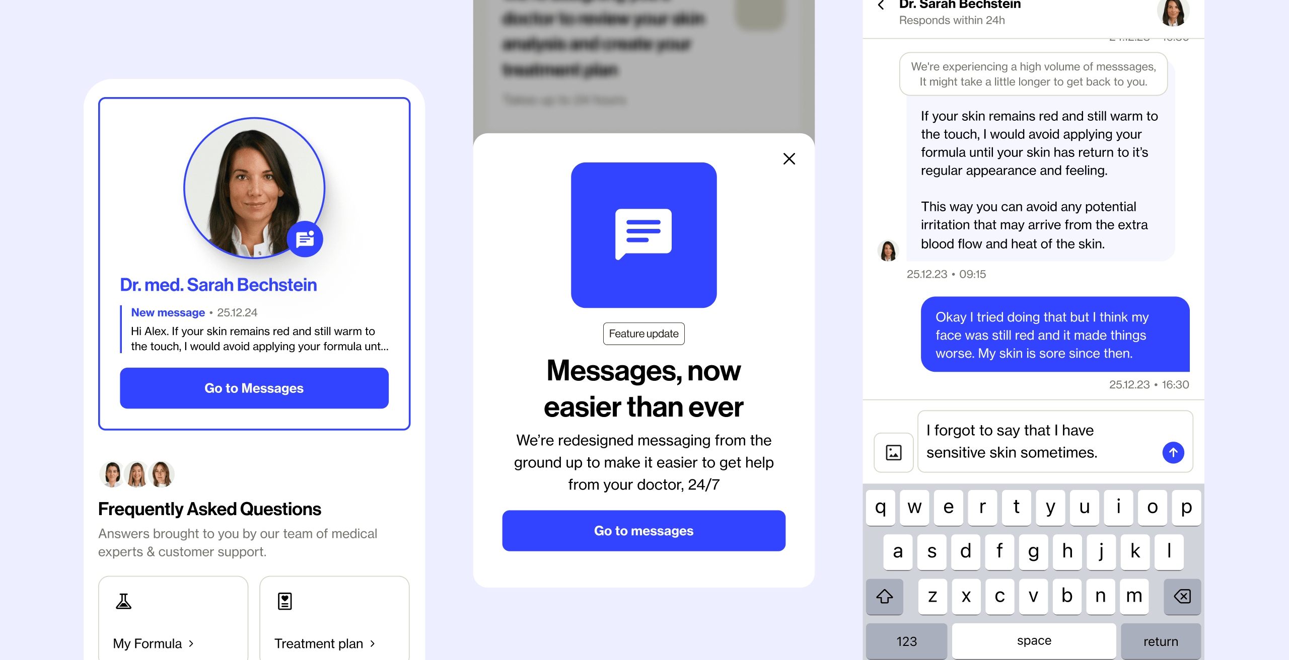
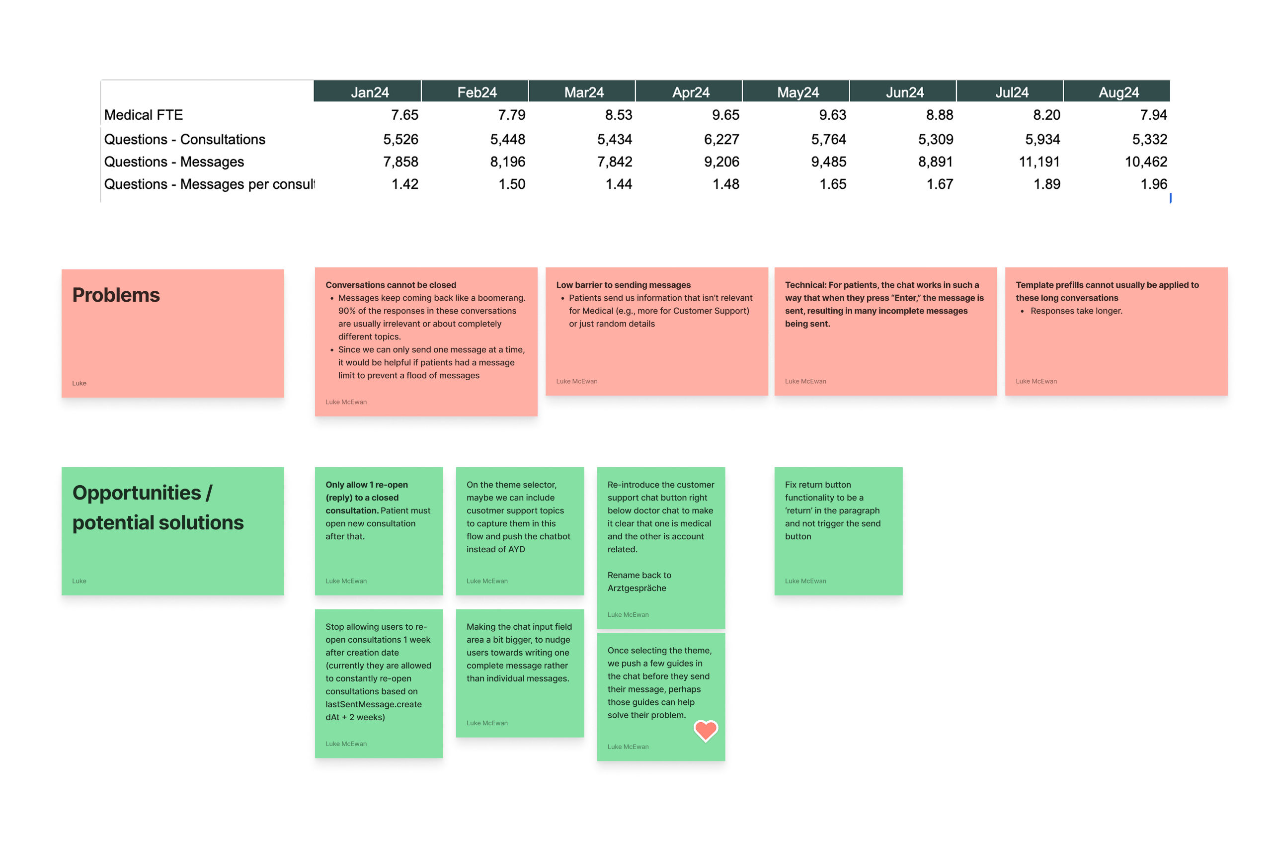
We launched the redesigned flow with a small test group before rolling it out more widely. Adoption and engagement increased significantly, especially in the first month. Patients who messaged their doctor early were more likely to stay, validating our retention hypothesis.
But the flip side was an unprecedented spike in message volume: from 7.8k → 11k monthly messages. Doctors flagged new problems:
Through workshops with medical, we introduced guardrails that balanced this new trust with efficiency. Quick replies that didn’t open new cases, limits on re-opens, and UI nudges like larger input fields to encourage more complete messages.

Quick Replies
Lightweight responses like “Thanks” that closed a conversation without triggering a new case for doctors
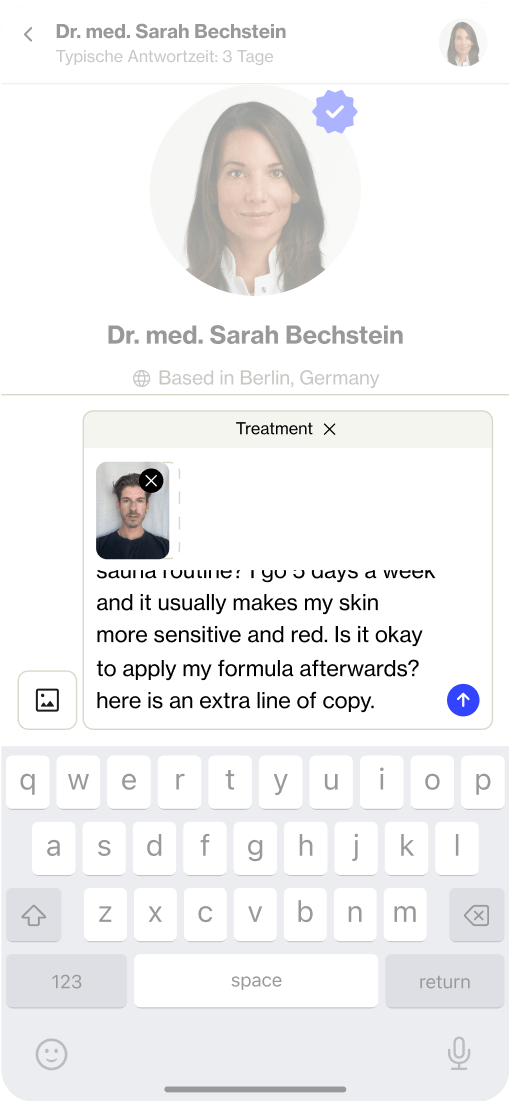
Increasing default input field size
Subtle nudge to write longer message instead of multiple short messages to reduce scattered messages

