


Formel Skin is Germany’s largest digital dermatology service. Unlike traditional dermatology, patients receive a personalised prescription for their specific skin condition, 100% online and updated monthly.
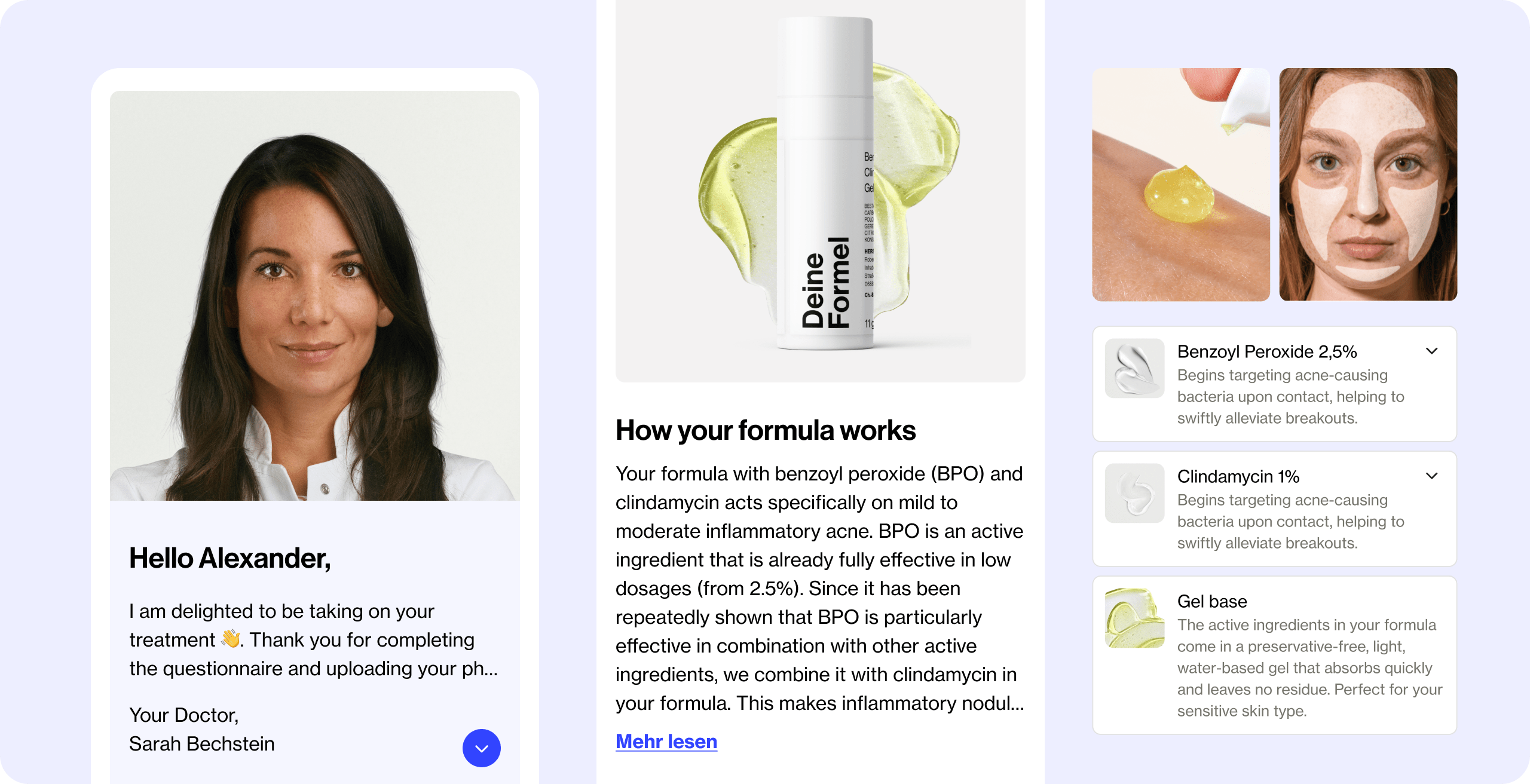
After doctors complete an evaluation, the first critical moment comes when patients open their treatment plan in the web app. This is where they meet their doctor and see their diagnosis and prescribed treatment for the first time. It sets the tone for whether they trust the process and commit to treatment, or cancel before giving it a real chance. Segmentation data showed a clear pattern: patients who saw a diagnosis surfaced in the app retained longer.
Yet qualitative research revealed many still questioned whether their treatment was truly personalised or if their doctor had reviewed their case. We aimed to humanise this first touchpoint with a visible diagnosis, clearer treatment details, and transparent expectations, building confidence from day one.
Client
Formel Skin
Role
Product / Prototyping / User research
Year
2024
The Problem
Patients arrived with years of frustration: conflicting diagnoses, failed treatments, endless contradictory advice online. Instead of reassurance, their first treatment plan often felt cold and generic: no visible diagnosis, walls of dense clinical text, and no guidance on when results might come. Instead of reassurance, it compounded their doubts. Many questioned whether Formel Skin was truly personalised for them and cancelled before treatment had time to work
The result: doubt, low trust, and cancellations before treatment had time to work.
“I’ve been struggling with my skin condition for years”
“No matter what i try, nothing seems to work for me”
“Doctors don’t really see me, they just give me a solution and move on”
“There’s so much information out there, I don’t know what to trust”
The Challenge
Patients wanted clarity, validation, and confidence from day one. Doctors needed space for nuance, safe guardrails, and workflows that didn’t add friction. The challenge was to find a way to surface diagnosis, severity, and treatment timelines in a way that felt personal and trustworthy for patients, without oversimplifying medical realities or forcing doctors into unsafe commitments.
💭
How might we build trust and confidence from the very first touchpoint, while staying medically accurate and scalable?
Surfacing Diagnosis, Severity & Treatment Duration
Adding a visible diagnosis wasn’t just about “showing more info.” For patients, it was about trust and clarity. For doctors, it was tied to clinical realities of uncertainty, workflow habits, and how much confidence they could safely communicate.
Complexities of Diagnosing a patient
Through workshops with doctors, we highlighted some tension between diagnosis accuracy and reassurance for the patient.
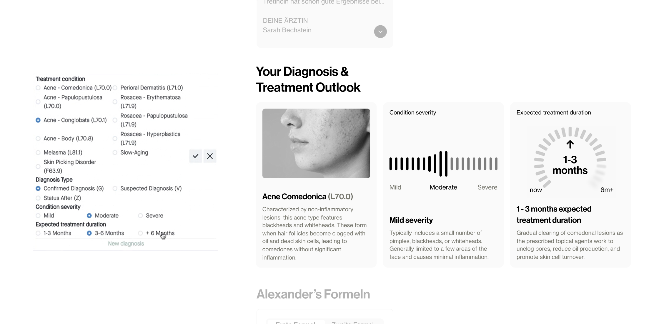
We explored making every diagnosis mandatory in the doctors tool, but doctors pushed back. It would have created false certainty and broken trust later if treatments had to change or there was uncertainty. The trade-off was to design a system that showed diagnosis when logged, paired with severity and patient-friendly language, so patients felt seen without doctors overcommitting.
Surfacing Diagnosis & Severity
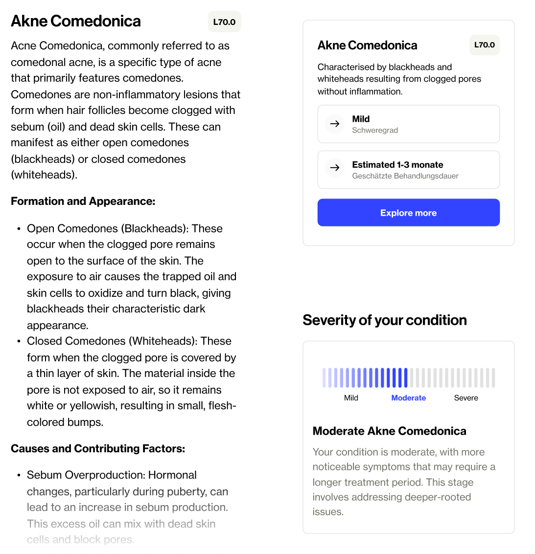
To reassure patients without over-promising, we designed a visible diagnosis paired with a severity scale.
To make it feel human, medical language was reframed into patient-friendly explanations that named the condition, its symptoms, and contributing factors. This gave patients validation while helping doctors set expectations without overcommitting.
Setting treatment duration expectations
One of the biggest anxieties patients had was: “How long until I see results?”.
We debated whether to show exact timelines (e.g. 6 weeks), but landed on ranges (e.g. 6–10 weeks). This set honest expectations without tying doctors to promises they couldn’t safely make.
The trade-off here was about balancing honesty with hope and setting expectations that encouraged patients to give treatment time. It was also critical that we didn’t lock doctors into promises they couldn’t guarantee.

Personalising the treatment breakdown
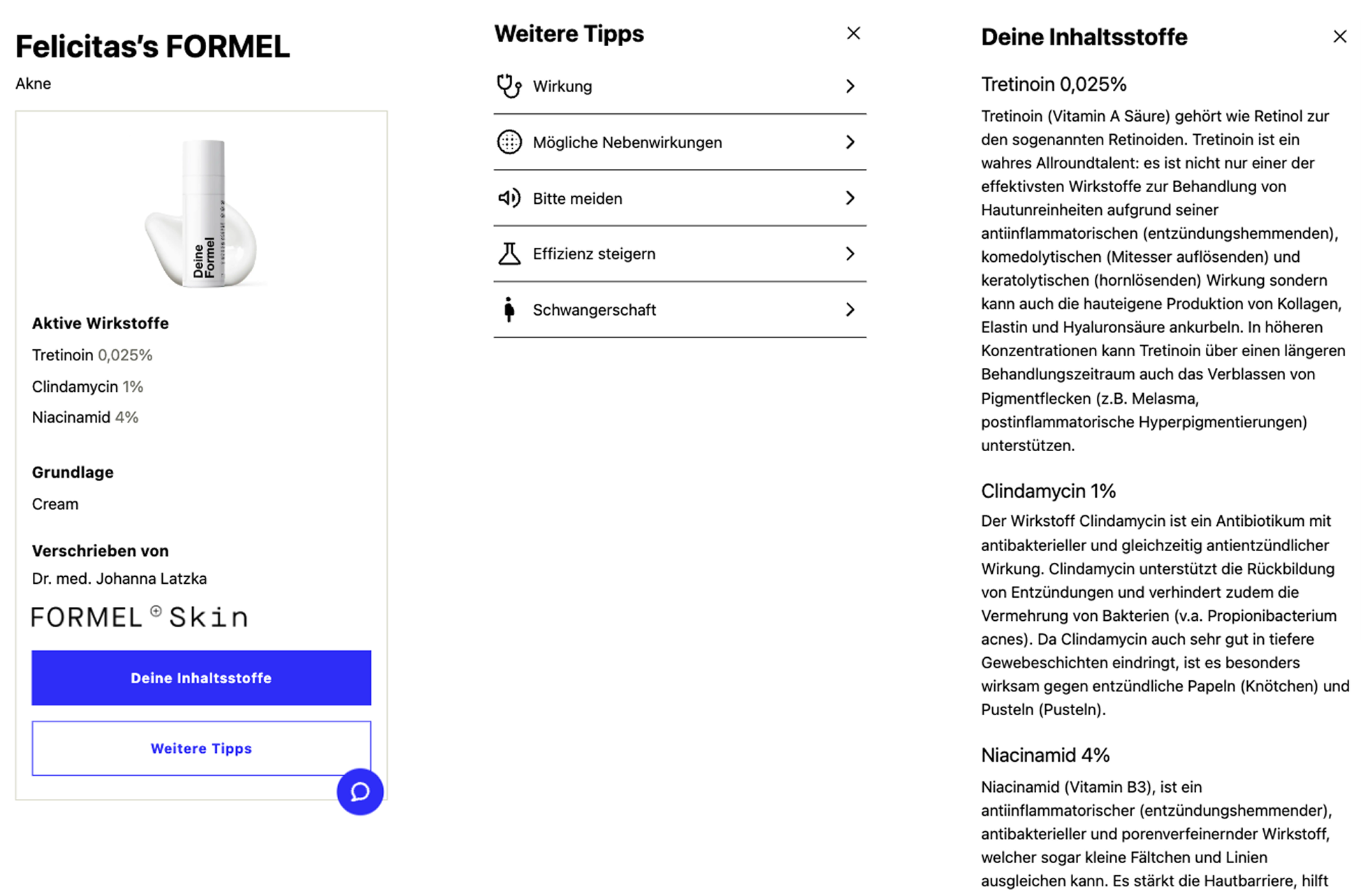
This was the moment where patients expected to see their personal treatment, that wasn't just another generic solution. Instead, the formula card felt flat and technical. Patients saw an image of their prescription bottle, a list of ingredients with concentrations, and a wall of dense clinical text hidden in accordions. The human part about why this formula was chosen, how it worked, and what the doctor’s plan was was burried in the accordions and FAQs throughout the web app.
For doctors, this structure was technically correct and clinically safe. But in patient interviews, it came across as cold and generic. Instead of reassurance, it reinforced doubts: “Did the doctor really tailor this for me, or is it just the same formula everyone gets?”
The challenge was to redesign this touchpoint so it built trust and clarity for patients, without creating extra work for doctors or losing medical accuracy.
Old plan page interface
Bringing clarity to patients personalised formula
We reframed the card itself to soften the complexity of their personal prescription. The image and ingredient list remained for clarity, but we elevated a short plain-language explanation as the hero.
From there, patients could explore more through progressive disclosure. The new detail view opened with How your formula works, a tailored narrative linking their symptoms to the treatment plan and explaining the what to expect from their formula over the first month.
This shifted the breakdown from a technical list into a treatment story. For patients, it felt human, specific, and personalised. For doctors, the modular structure meant content could scale safely across conditions and formulas without extra authoring effort.


Formula highlights & active ingredients
To improve scannability, we mirrored familiar patterns from beauty products. Each plan showed four highlights (e.g. targets oil production, reduces bacteria) that explained effectiveness in plain language. Ingredients were presented with swatches and tiered explanations, a short summary upfront and expandable detail for those who wanted to dive deeper.
The same ingredient could be framed differently depending on the patient’s condition, but drew from a shared system so doctors weren’t creating bespoke content every time.
Clear guidance & reassurance
We restructured practical and emotional support into clear, distinct sections:How to use your formula:

Designing for modularity
This wasn’t about designing one perfect page. The plan needed to work across 5–6 conditions and scale to 30+ formulas, each with different variations.
I worked closely with medical and engineering to map which content was dynamic (diagnosis, severity, ingredient explanations) and which was static (application guidance, general precautions).
Engineers got clarity on reusable components; doctors could rely on structured content that scaled without extra writing.This modular approach ensured every patient saw a plan that felt personal and trustworthy, while keeping the system safe, efficient, and scalable.


